Covers of the LOE Series
October 9, 2017
We’re up to 12 League of Elder books now, and we’ve pumped out some sweet covers over the years, all by the Queen of the League of Elder, Carol Phillips. A lot of times the artwork gets messed up by my poopy text.
I thought we would review all of the covers naked with no text.
But, before we begin–a quick note of comments. Over 5 or 6 years, this blog has received only a handful of comments. I’d love to hear what you think–do you like these covers? Do you hate them? Say something–let me know all about it.
Book 1–Sygillis of Metatron

The original Book 1 cover by Pat Larsen
Back in 2009 we put out the First LOE Book: Sygillis of Metatron. The original cover wasn’t done by Carol P, it was sketched by Pat Larsen. I used it for about a year, and then was told, in no uncertain terms, that the cover came up short in a number of areas.
I determined that a change was needed. I took to the internet looking for an artist to redo the cover for Book 1.
The very first name that came up on my search was Carol Phillips–fantasy artist. I sent her a note. She responded and it’s been golden ever since. I sent Carol a number of scenes from the book and allowed her to pick which one she wanted to try. Eventually, she settled on the scene in Metatron where Captain Davage is reunited with Syg. I thought the scene needed a little something, so we added Carahil, though, as written, he had already escaped Metatron prior to Syg’s arrival. Little changes that don’t fit in with the narrative are called Nixies. Nixies add a little drama to the scene.

Sygillis of Metatron, revised, by Carol Phillips
Carol’s cover was designed as a front-only image. We used a grab of the city of Metatron for the back cover. Not until Book 9, “Stenibelle”, would we use a front-only design.
Book 2: The Hazards of the Old Ones.

The Hazards of the Old Ones, by Carol Phillips
Book 2 is without a doubt the most metaphysical and pastoral cover of the group. We usually select exact scenes from the various books, this one was more abstract, combining several scenes together as one. We presented it as a wrap-around cover, with the scene extending to the spine and the back cover. I thought that the scene looked best all at once–it lost a lot of impact wrapped around, so we eventually revised the cover to the front only.
Book3: The Dead Held Hands

The Dead Held Hands, by Carol Phillips
Book 3 is the first in the Temple of the Exploding Head trilogy. It carries on the tradition of featuring Carahil on the cover, he has been on all three so far. Carol often places a “surprise” on the spine–in this case it’s Castle Blanchefort in the background. I had to beg Carol for the green flags on the spires of vacant Castle Durst.
Book 4: The Machine

The Machine, by Carol Phillips
Book 4 is one of my favorites. Once again Carahil appears on the cover though he’s a little harder to find. Thomasina 19th appears on the spine. The green cars are actually “cable cars” with cables going all the way up to a vehicle in orbit–though Carol didn’t want to have a cable messing up her artwork, thought it was a “Bob Ross” move. I thought the Princess Marilith vending machine was a nice touch. Carol put her initials “CP” on the dumpster.
Book 5 The Temple of the Exploding Head

The Temple of the Exploding Head, by Carol Phillips
I remember I was on vacation in Florida when we started working on this one. I told Carol to “Go Nuts”. I think the results speak for themselves.
Book 6: Sands of the Solar Empire

Sands of the Solar Empire, by Carol Phillips
Book 6 is the beginning of the Belmont Saga, featuring the intrepid Paymaster Stenstrom. The scene takes place in the Sanctum Sanctorum of the Bones Club. I based the scene off of a Masons lodge that was being torn down–they had a central oculus.
Book 7: Against the Druries

Against the Druries, by Carol Phillips
Book 7 is one of my personal favs. I’ve had a crush on Lady Alesta of Dare for some time., and there she is. I like the drama in the painting. As per usual, one of the giant Cronins appears on the spine.
Book 8: The Shadow tech Goddess

The Shadow tech Goddess, by Carol Phillips
The first book in the Shadow tech Goddess series. I think this is one of the prettiest covers–I like the colors. I also enjoy seeing Hannah-Ben Shurlamp on the cover.
Book 9: Stenibelle
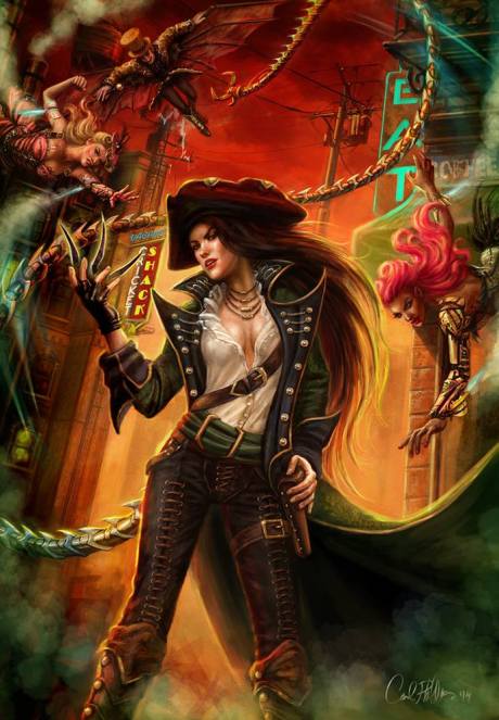
Stenibelle, by Carol Phillips
Book 9 sees a return to a front-only cover. Book 9 also sees Paymaster Stenstrom as a woman in an alternate universe. This one seems to be Carol’s fav cover. She likes the color scheme and the various element, like the flying hookers swooping down to pounce on Stenibelle. Stenibelle, who appears as a man in other books, looks amazing.
Book 10: The House of Bloodstein–Perlamum

The House of Bloodstein: Perlamum, by Carol Phillips
The House of Bloodstein books add a touch of horror to my usual sci-fi/fantasy. The Machine in the background returns from the Temple books. The silver kingfisher is King, a favored character of mine.
Book 11: the House of Bloodstein–Mentralysis
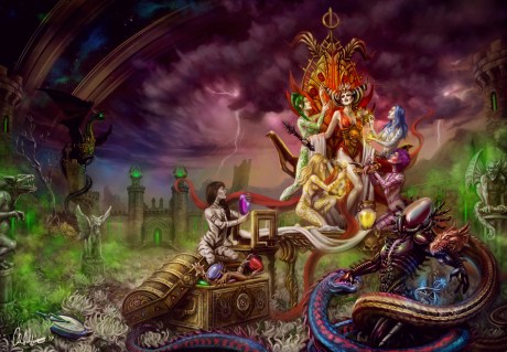
The House of Bloodstein: Mentralysis, by Carol Phillips
This cover features Queen Ghome, one of my favorite bad guys. I just love her. I wanted a really colorful cover, and Carol delivered as usual.
Book 12: The 6th Turn–Kat

The 6th Turn: Kat, by Carol Phillips
A return to the Shadow tech Goddess books. This once deals with an alternate version of Kat, who really developed into a cool character over the various drafts. Carol designed her with a massive Mohawk, which I wrote into the story.
We made a conscious effort to make the Shadow tech Goddess sub-books look the same, so the formatting for this one resembles Stenibelle.
copyright 2017, Ren Garcia and Carol Phillips

The first four of Carol’s covers have always been favorites. Book 9: Stenibelle is perfect with design and brilliant color. The covers that follow seem to be introducing a wider range of color as well. All great work by Carol.
Carol also likes Stenibelle the best. l think my fav is the Hazards–I’m not certain why. I think I favor its dreamlike quality.