HOB: Picking a Cover
November 4, 2015
One of my personal favorite portions of the book creation process is the formulation and execution of the cover. It’s a lot of fun putting my head together with talented artists, like Carol Phillips, and seeing what shakes loose.
For my next book, the unbridled House of Bloodstein: Perlamum, the planning process followed the usual pattern.
SO MANY SCENES
First, we hash out what scene we want to layout for the cover. I usually pick seven to ten scenes from the book that I think are interesting, pertinent to the general tone and feel of the book, and that will be strong enough to catch the eye of a passing shopper.

Unused cover ideas generally are placed in the interior of the book. (Carol Phillips)
I type up a quick synopsis and send them off to Carol. Now here’s the weird part–even though this is my book with my characters and scenes, Carol has a great deal of say-so in what shows up on the cover. Using her polished artist’s eye, she selects what scenes to expand upon, often asking to read those select parts of the book, and scribbles up a few quick sketches for reference. Then, between the two of us, we agree upon the final subject matter for the cover. As for the rejected cover ideas, those almost always end up in the interior of the book–Carol’s work is just too good to throw away.
WHAT’S A “NIXIE”?
Most of the covers we do have at least one Nixie lurking around in them somewhere. A Nixie is an element on the cover artwork that either A)-has been greatly modified or exaggerated from the text, or B)-wasn’t in the book at all. We do this to give the cover composition a little more life and eye-candy where needed. Usually the Nixie isn’t too egregious and we never promise something on the cover that is not delivered upon in the book–we just change things around a little bit sometimes. For the House of Bloodstein, there is one minor Nixie in the artwork, but nobody other than Carol or me knows what it is–and I’m not telling.
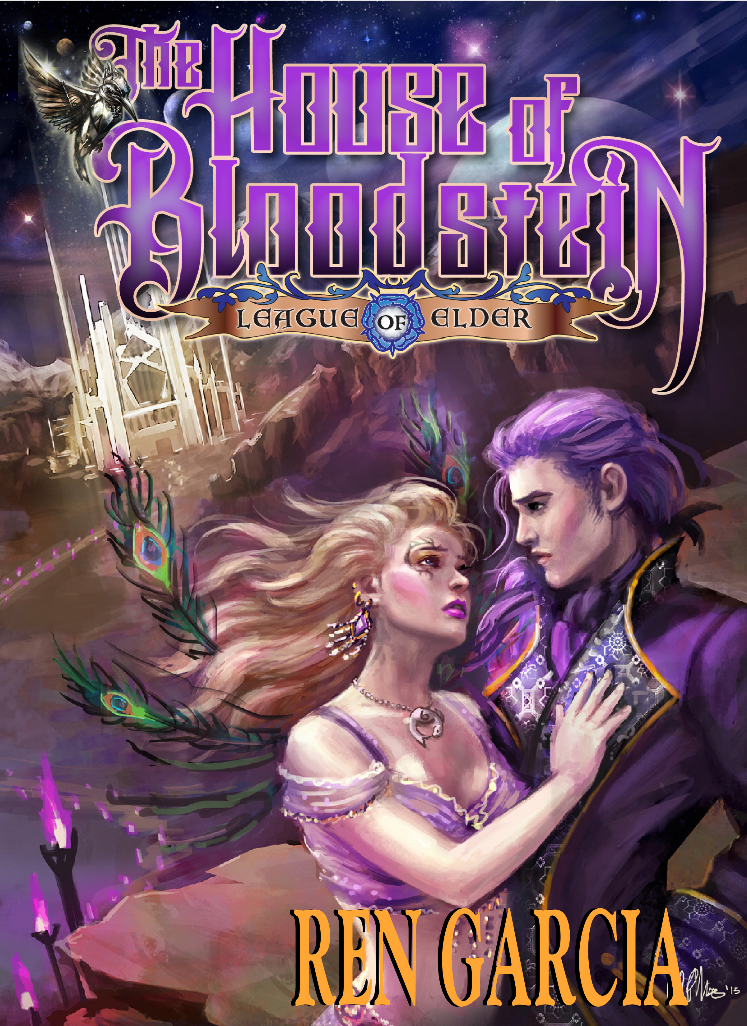
The House of Bloodstein, by Carol Phillips
Depending on her workload, it takes Carol about three or four months to finish the cover–all of it painted digitally one little element at a time. Since Book 2 (The Hazards of the Old Ones) we’ve opted for a wrap-style cover, meaning the artwork goes all the way around to the back cover, including the spine. Having a larger canvas to paint on allows Carol more freedom create a knock-out piece of work, though she has to be careful to place the key bits of artwork on the front part of the painting (the right side) and a bit less on the left side (the back) allowing for the rear-cover text. You can tell on the finished work above the left side of the composition has a lot more free space than the right. Carol also likes to put a little surprise on the spine. Can you see what the surprise is??
GOING LOOPY FOR LETTERING
 Having the finished piece of artwork is just the first part, now we’ve got to letter it, and that’s a great deal tougher than you might first think. It takes talent to thoughtfully, and tastefully, letter the cover. You want the lettering to pop out, to be easily readable from a distance, or, more importantly, from a tiny thumbnail on a website. As The House of Bloodstein is a somewhat gothic tale, I wanted something in that tone, and I imagined the lettering in a twisting block layout. After some mixing and matching, we decided on the above, it’s got the gothic theme I was looking for, I like how the letters fit together and the purple matches the artwork well.

Current cover configuration for Book 10–The House of Bloodstein
Now, comes the painful part–how to add the lettering without covering too much of the artwork. That is always a struggle–what to sacrifice without losing the spirit of the composition. In this case, we couldn’t find a good spot to put the lettering, either going high or low, it ruined the artwork. We decided on the old trick of dimensioning down the general size of the artwork, creating a significant void space where the lettering can freely go. We’ve done that before, way back on the revised cover to Book 2, we scrunched the entire piece onto the front creating a void space on the top and the bottom. Here Carol uses a gothic pattern stained a handsome shade of red and black to fill in the void.
The back cover is full-sized and covered with around 250 words of back-cover text strategically placed around the characters.
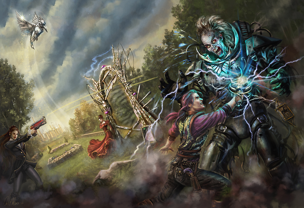
The over-all effect is great. You get the impact of the large-sized lettering without having to cover up too much of the artwork–we still get to witness Lord Kabyl of Blanchefort locked in a mortal struggle with a horrific giant-sized space guy in the cool green passes of the Telmus Grove. Cool stuff.
MATCHING TONE WITH CONTENT:
This cover mock-up, although beautiful, looks more like a cover one might find on a romance book, which is not the case here. (Carol Phillips)
One final word of note. Unless you’re aiming for some sort of sick satire, you want the tone of your cover to match the tone of your story. If you’ve written a twisted tale of the macabre, you really don’t want a lot of sunshine and lollipops on the cover, otherwise you’ll confuse your readers. The House of Bloodstein is an imaginative action thriller, so we opted for an action scene. Had the book been more focused on romance, we would have selected the cover mock-up on the left, which gives the impression of loads of romance, conflict and general male/female drama to come.
Bowl Naked
RG
The House of Bloodstein: Perlamum, will be released in late 2015 from Loconeal Publishng
copyright 2015, Ren Garcia and Carol Phillips
